Making pages and grids responsive for mobile devices
Web apps allow you to interact with people both on desktop as on mobile devices. When you use tables (grids) for data on your web pages, chances are mobile devices can’t properly show all columns. Therefore, you can add the class ‘hideMobile’ to the columns in your XML that you don’t necessarily need on mobile.
<Column ID='PhoneCustomer'>
    <CssClass>hideMobile</CssClass>
    <VisibleIndex>2</VisibleIndex>
    <PropertiesTextEdit>
        <EncodeHtml>False</EncodeHtml>
    </PropertiesTextEdit>
</Column>
To make it work, you must also give the table ID the property ‘display: block’ or ‘display: inline-block’:
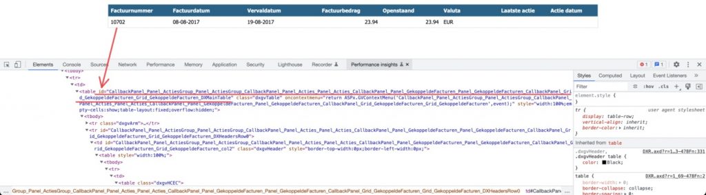
display: block;You can find the ID in the inspector of your browser (right click with your mouse and select Inspect or ‘Ctrl + Shift + I’/’CMD + Option + I’). It should look like this:
In our example, you will add the following to your custom CSS:
#CallbackPanel_Panel_PortefeuilleOverzicht_Panel_PortefeuilleOverzicht_CallbackPanel_Panel_Debiteuren_Panel_Debiteuren_CallbackPanel_Grid_Debiteuren_Grid_Debiteuren_DXMainTable {
    display: block;
}
You can copy the code and replace the ID with the ID(‘s) of your project.